Let's plan your family's outfits
Styling your session doesn't have to be stressful.
Time and time again, I hear it that planning your family's outfits for our photo sessions is the most stressful part. I get it - I do not consider myself a stylish person and shopping is far down on my list of favorite things to do too. Over the years however I have learned that putting in just a little bit of work into stying your family can help make your final images more aesthetically pleasing. Trust me, when your outfits really go together you're most likely to love your final images and that is my ultimate goal!
I've got you!
In my first ever blog post, I've set out to help take the stress out of outfit planning and styling your family! ENTER: outfit mood boards below! Make sure to keep reading too! After each one I'll break down why the look "works" in my opinion to help you effectively begin planning your family's outfits!
Need some extra help?
These boards aren't meant to be your exact looks BUT I will include the Amazon links incase you see a piece you love! If you're still stuck and/or you want my advice reach out! I'm here for you!!
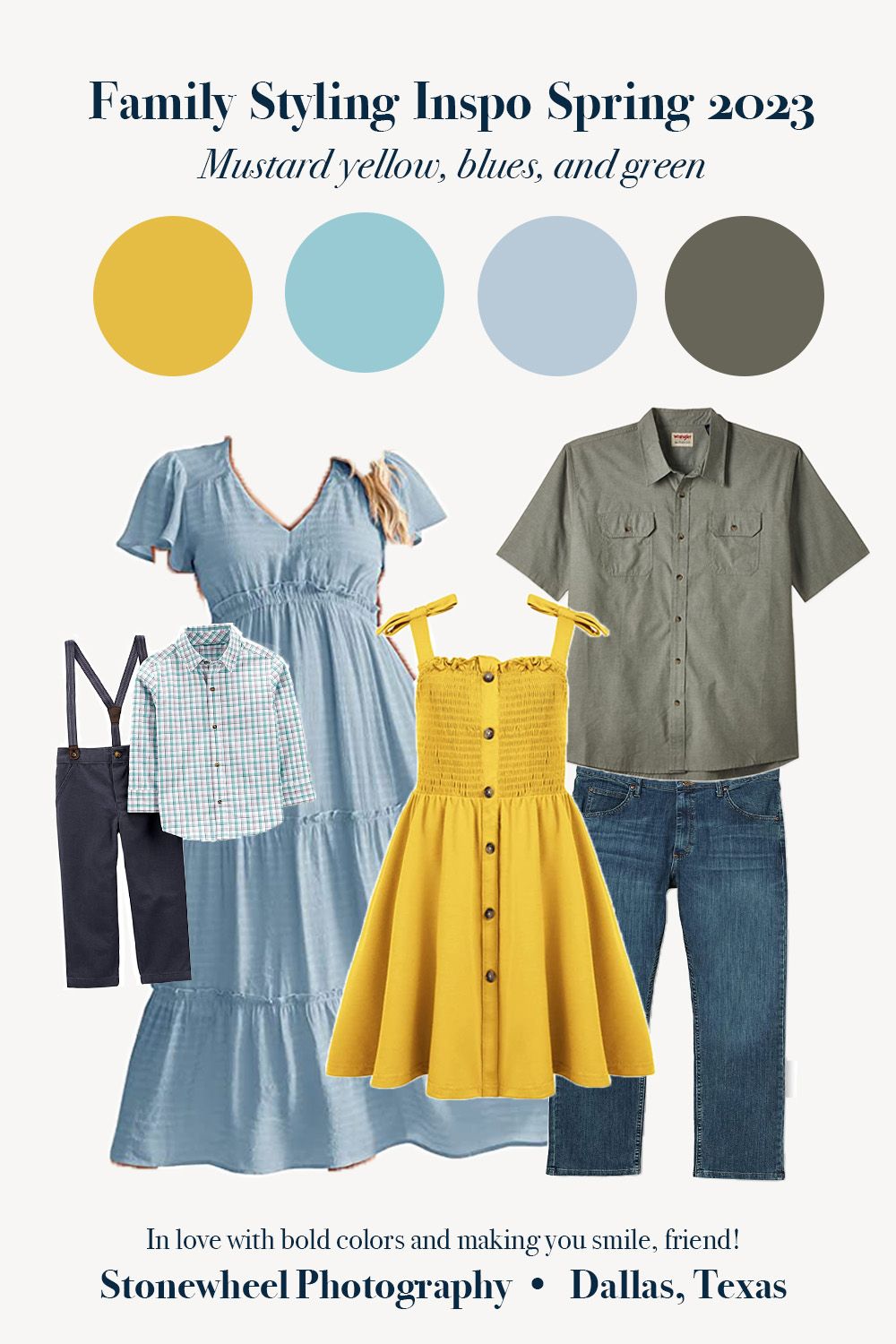
Mustard yellow, blues, and green: Why it works...
Nothing says "spring" to me more than light blues, yellows, and greens. As you know I love BOLD colors though. So, although this palette has lighter blues they're balanced out with dark blue jeans and the bold mustard yellow dress.
Don't over do the patterns
Little one's shirt is a "plaid" looking pattern. Plaid is generally not my favorite - it can look distorted in pictures and can be very difficult to work with. When it's the little one in the group though, plaid can often work to help tie the family's look together. Here little one's shirt helps tie the family together by pulling blues and yellows (colors from other family members' outfits).
Bring in textures
The materials in the dresses, shape of the sleeves & straps, and the buttons bring in great textures which help add depth and interest to the family's look!
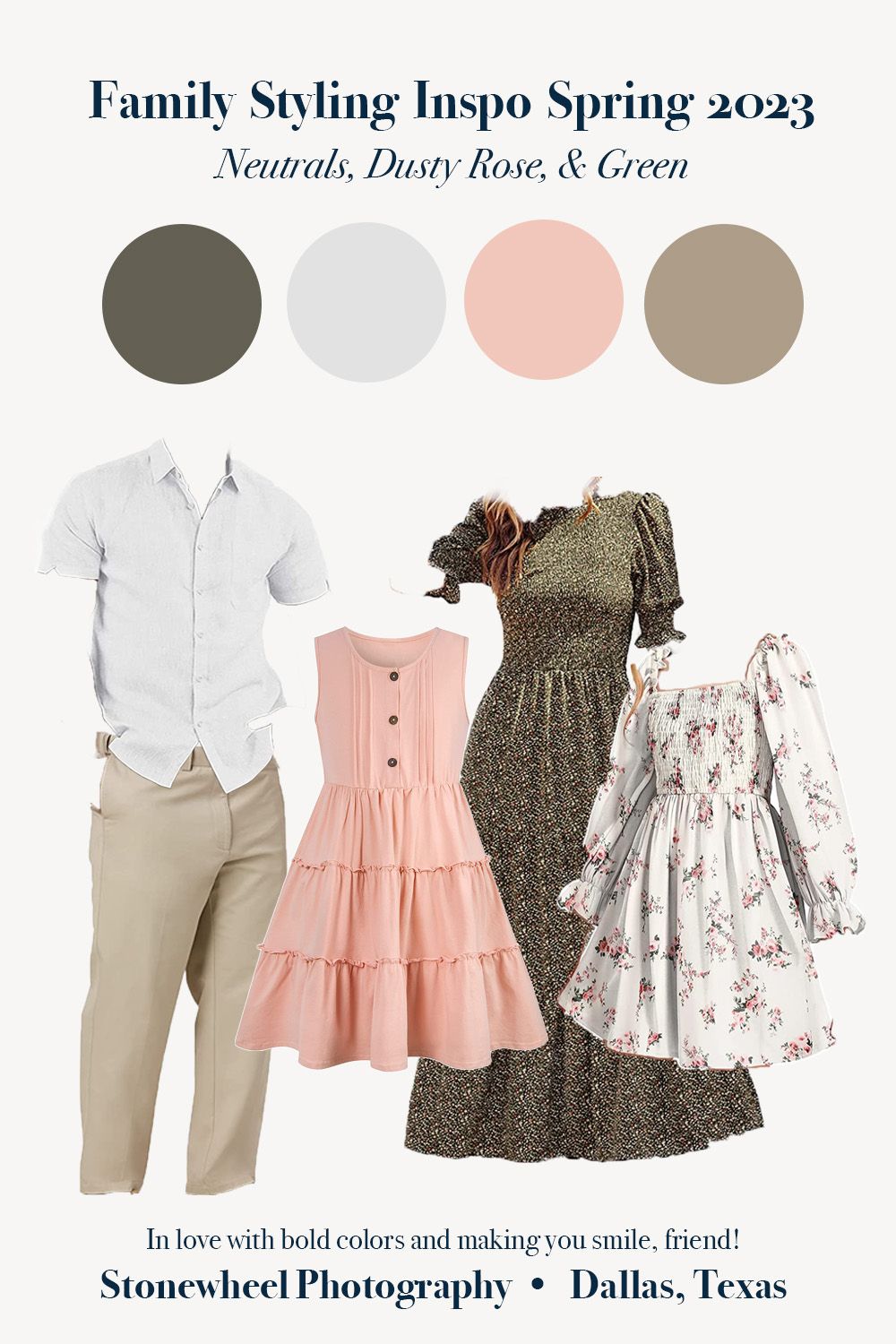
Neutrals, dusty rose, and green: Why it works...
It is always a good idea to start with neutrals! Since I love capturing you outdoors, using neutrals to complement your bold colors helps make you look like you match the environment.
One piece ties the family together
The white floral dress pulls colors from every other family member's outfit (green, pink, and white).
Caution with the patterns
I'd usually steer you away from too many patterns but since the green dress has small print, the white dress is not entirely covered with florals, and the other two outfits are exclusively solid colors, they balance out nicely here!

Warm & Earthy Spring: Why it works...
Okay. I know what you're thinking, "This looks like fall," and you're not wrong... but I don't care because it totally works for spring too! This color palette is one of my favorites ever to edit (give me a rustic orangey-brown-and-yellows any day of the week). These colors on a warm spring day, when all the foliage is full and the sun is setting just right will give these final images a beautiful warmth. Plus, since the outfits don't scream Easter at you they're more likely to look great on your walls year-round!
Creative outfits
Don't want to wear a dress? Go for a skirt, a romper, or even overalls! Incorporating a couple statement pieces is a great way make your photos look truly "styled." Also, my heart always melts at suspenders (is it just me?).
Caution with the patterns
Again. The patterns here are borderline BUT since one is floral and the other isn't AND they're plenty of other family members in solids, it works.